
Maynooth Furniture
Building a Website And App Concept Designed To Facilitate The Shopping Experience

Maynooth Furniture
Building a Website And App Concept Designed To Facilitate The Shopping Experience
• July - September 2022 (10 weeks)
• Solo project
• Adobe XD
• User Research
• UX design: Wireframing, Prototyping
• UI design and Iterations
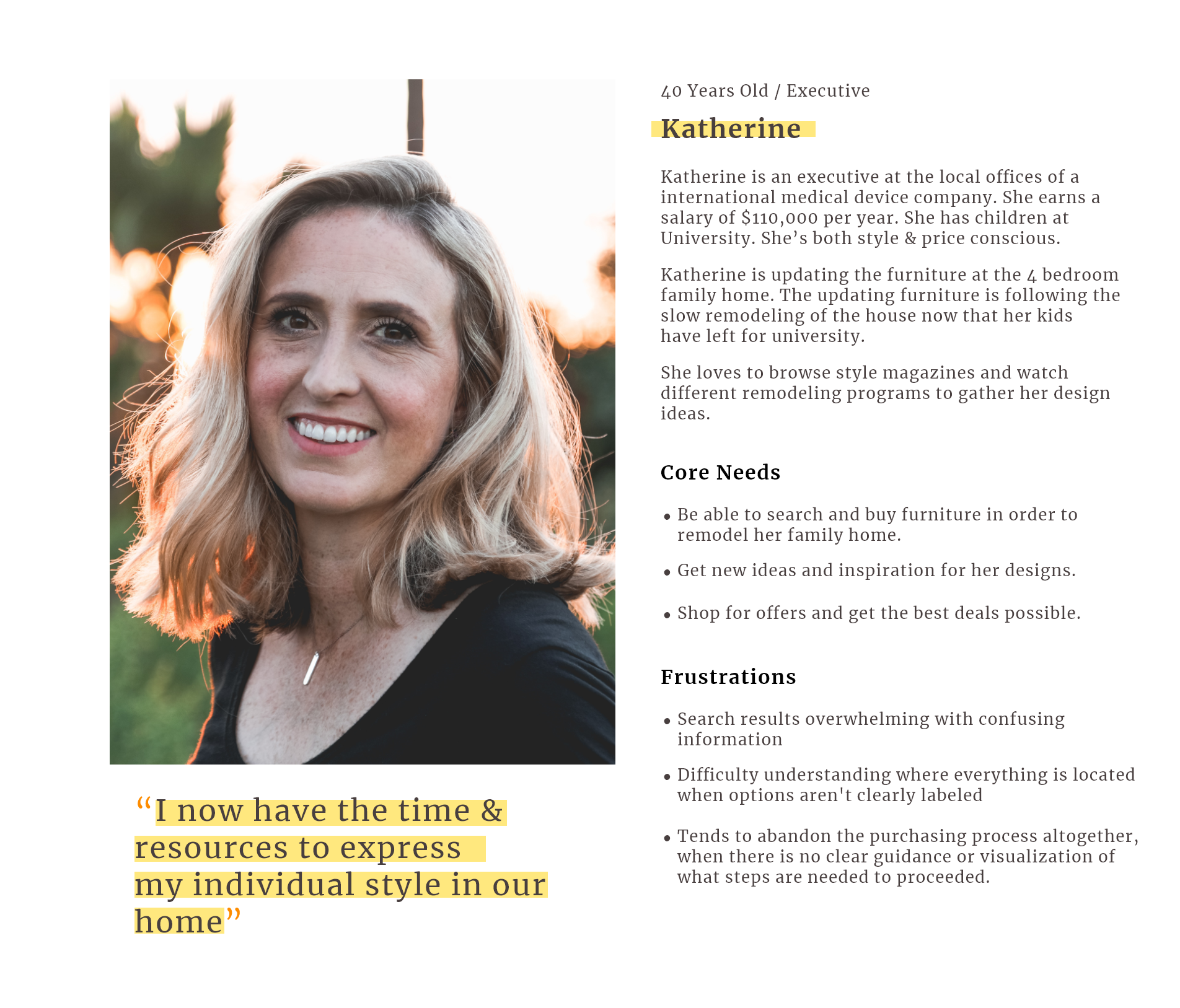
As technology continues to move forward, middle age users that aren’t tech savvy seem to have a hard time shopping for furniture online. They also get confused when trying to acquire the furniture once they are able to find it.
I started my research looking at how similar apps are designed and getting into the mindset of why they decided to organize and implement their features and products the way they do. This helped me get an idea of the experience a user might be looking for in an app.
It was crucial for me to understand and experience the problem first hand. For this, I conducted interviews with 6 different people, over the age of 40, that manifested difficulty during online shopping. I asked them questions below to find trends on why they had difficulty during online shopping, in comparison to a younger group of users.
1) When was the last time you did shopping online?
2) In your experience, what was the most difficult part about trying to shop online? Why?
3) Do you feel it’s safe to introduce your personal information in online shopping apps?
4) What was your process for trying to buy a particular item online?
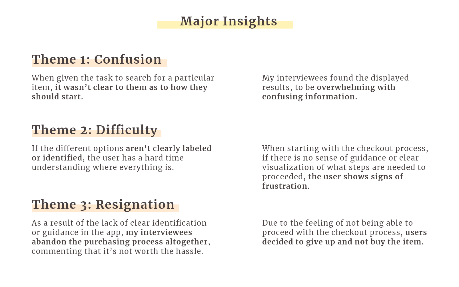
The other applications my interviewees used failed to provide good shopping experiences due to LACK of clear identification of options and guidance during the shopping process.
Being able to sit in person with my interviewers and have them show me their process while using similar applications, it became clear to me that most of them had one thing in common, they are designed assuming that everyone already knows and understands how to interact with the app, and where everything is placed.
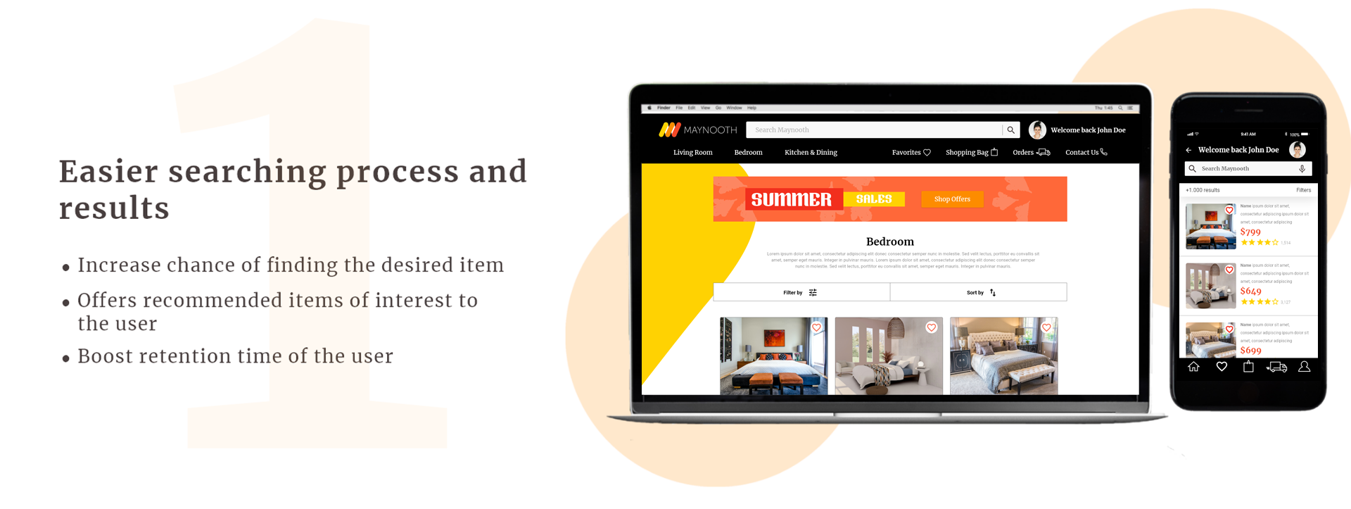
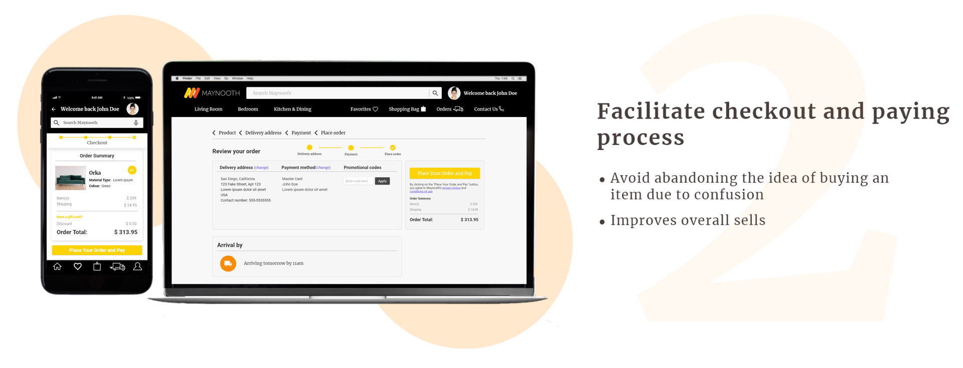
The main focus was to ensure a simplistic design, while making sure it was easy to understand and use. I started to look at different UI to better determine how to space out the sections and features in the app and understand the flows they implemented. I also wanted to make sure that the colors and esthetics used would provide a warm and pleasant sensation to the user.
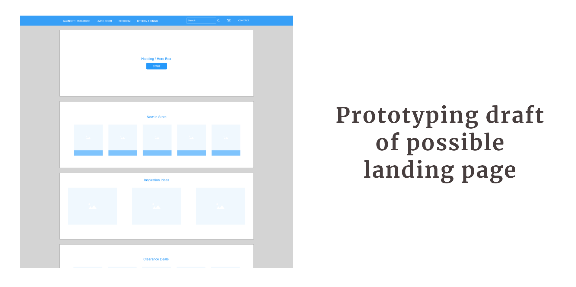
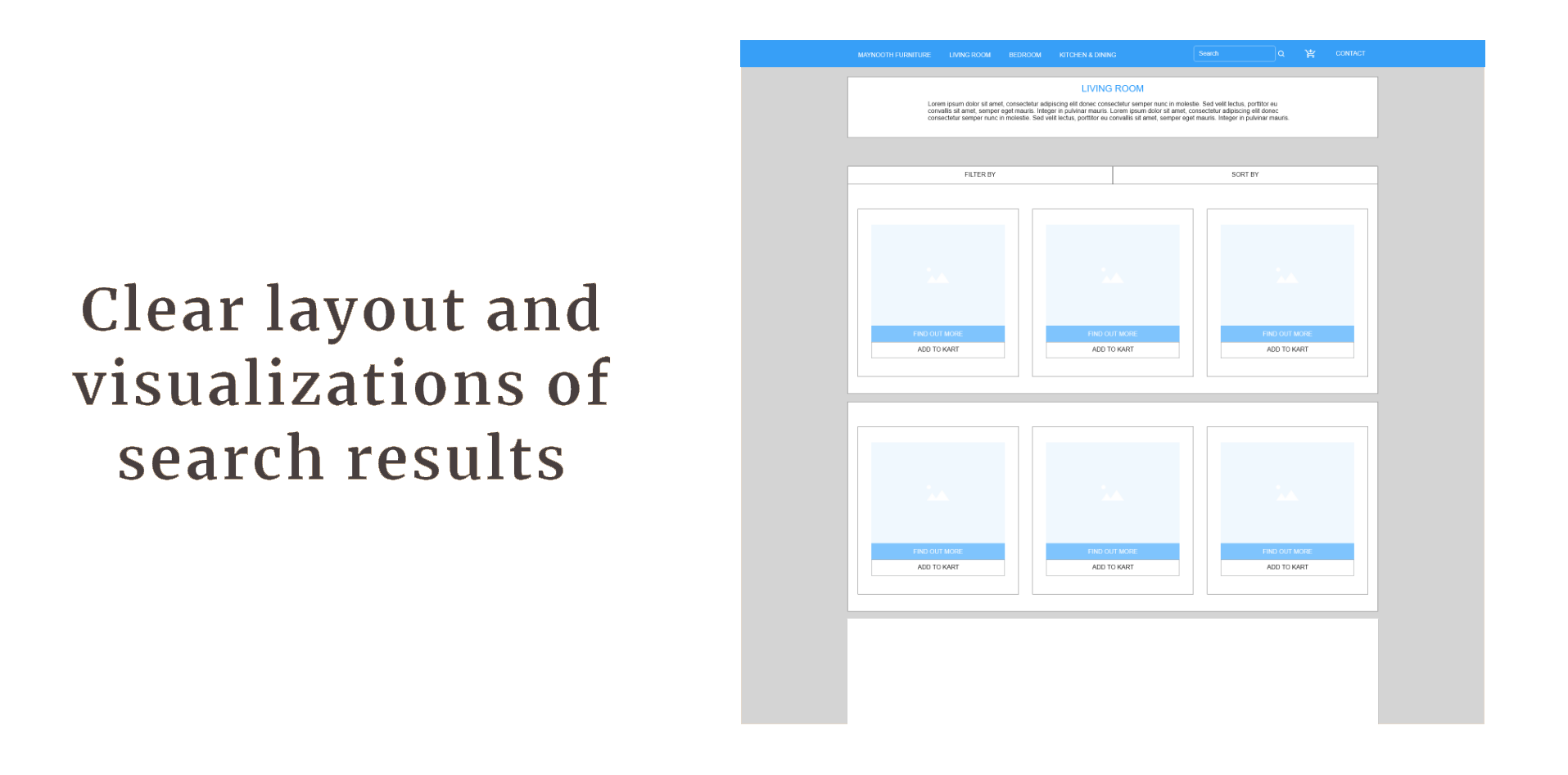
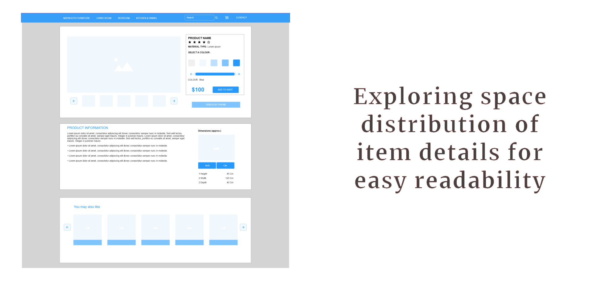
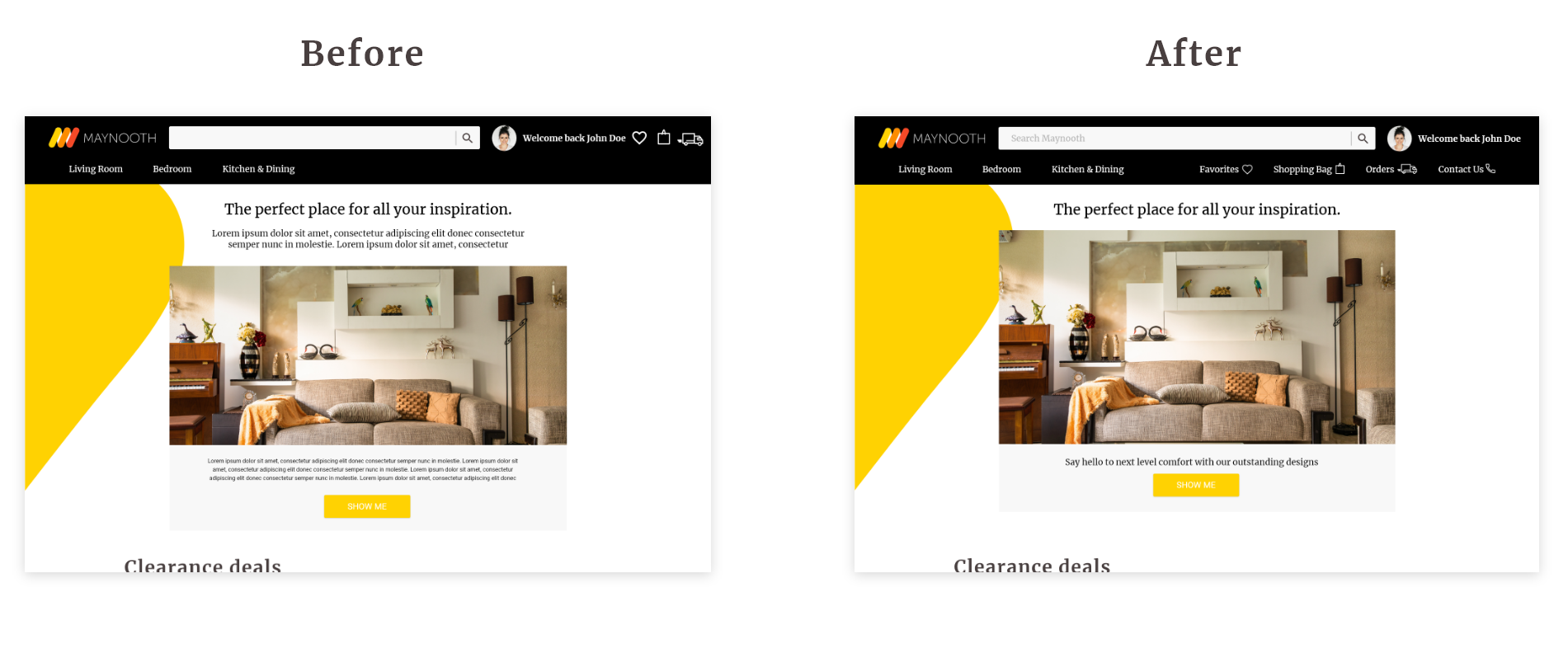
After establishing a base design, it was finally time to do some user testing. I onced again sat down with my 6 previous interviewees to see what their thoughts were on the first design, and got mixed feedback. I continually iterated my design over the span of 4 weeks, with 2 major improvements:
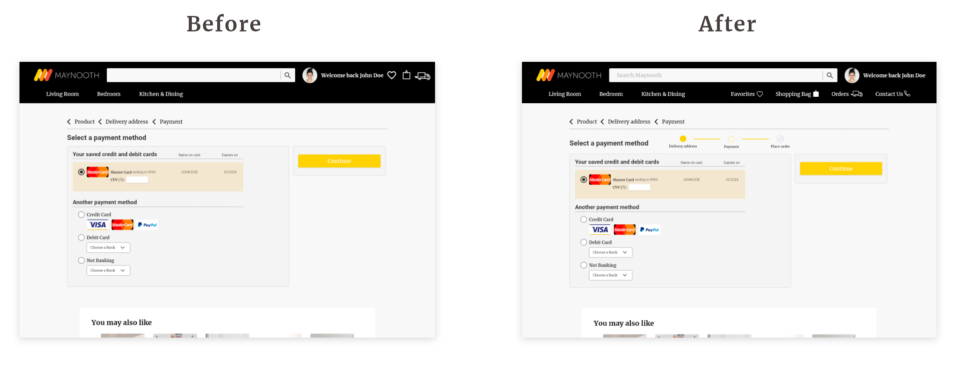
Based on feedback from my interviewees, adding clear labeling and identification in the Navigation Bar alongside the icons was crucial, due to the fact that the functionality of said icons weren’t always obvious to them.
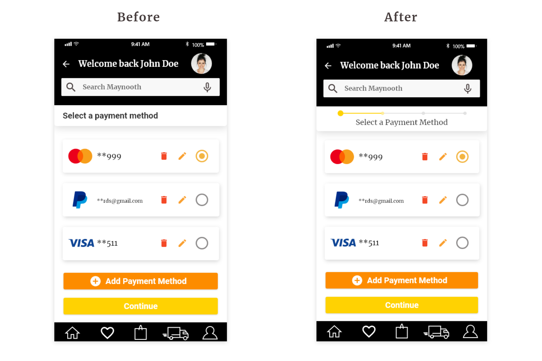
Letting the user see the payment steps, as well as what step they were currently on, allowed for clear guidance and fulfillment of the purchase.


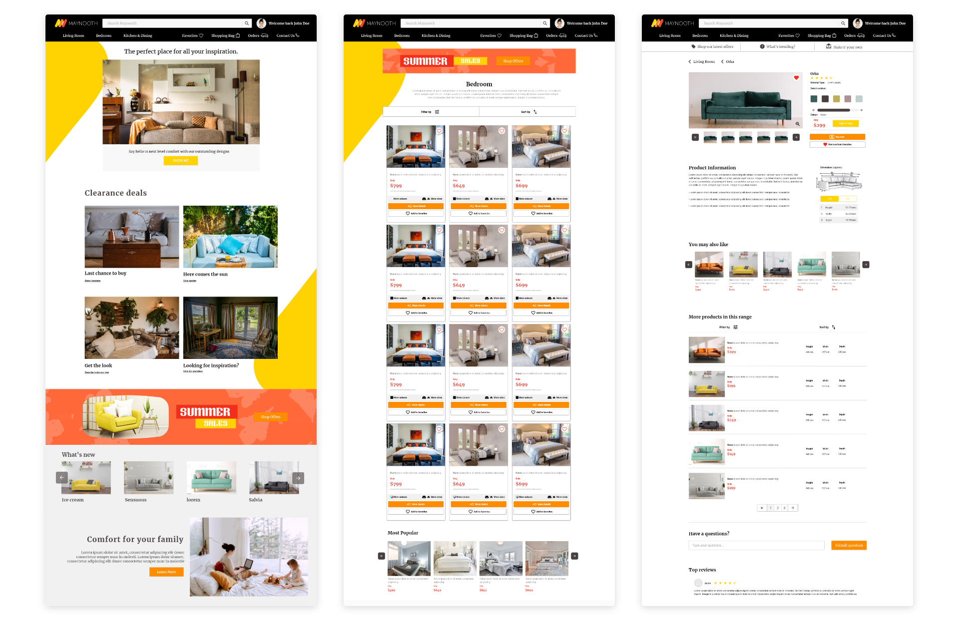
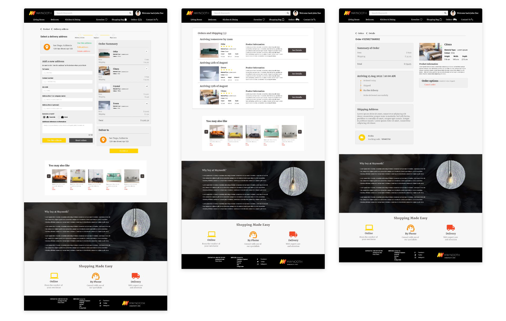
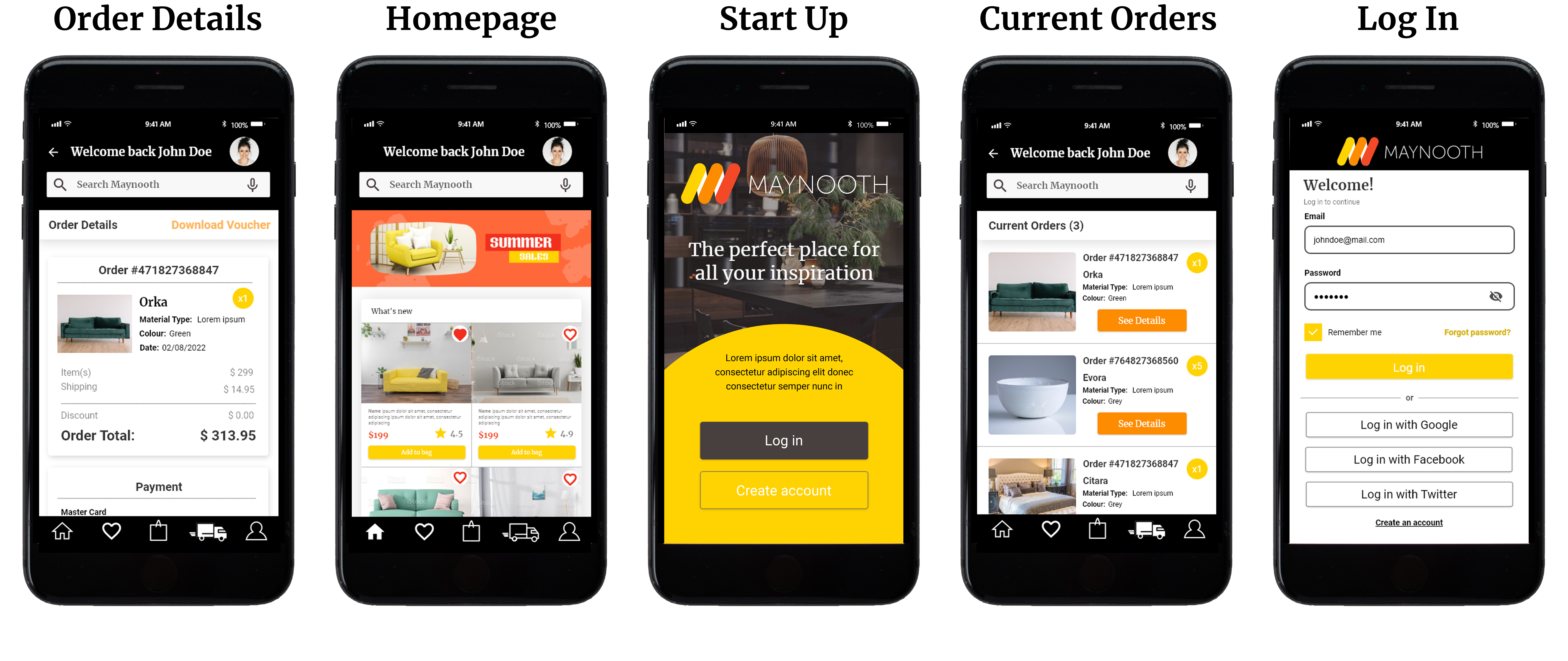
1) Experiencing the problem first hand is the best research. The only way to really understand someone's problem is to be in their shoes. This project made me learn not to assume what difficulties other people might have.
2) Iterate as much as possible. In the beginning stages, I explored many different ideas to try to obtain the best solution possible for the users. Once I got feedback, I was able to make different iterations to make sure every aspect of the app was designed with intention, thus creating the best possible experience for the users.
3) Focus on the main goal. Despite my initial research and weeks of development, my first version of this case study was full of unnecessary features and lacking key components. I found myself asking “what is the main goal that needs to be accomplished?”. Hence, I cut down by more than 50% the design and focused on the major points in my project. Moving forward, this reaffirms my belief that more isn't always better, what matters is achieving the main objectives, even if you need to tweak the design during the process.
4) Insanity is doing the same thing over and over and expecting different results. From noticing mistakes in my UI, to uncovering more foundational UX problems in my app, I’m thankful to have constantly asked for feedback. This allowed me to have a different perspective during the design process and not just blindly focus on what I thought was necessary to create a great app. It helped me to keep on pushing forward and create the app as best I could, while allowing me to have a clear vision and understanding of what was best for the user.
For more work inquiries do email me at ajdm199231@gmail.com